The EVO and other cutting edge Android phones are quickly blurring the line between phone and computer. Case in point it is now possible to host a website on your Android powered device! Ok, pick your jaw off the floor, I am going to teach you how!
Step 1: Download the FREE web server app off the Android market. Search for kWs on the Android market and your first hit should be the web server. Download it and lets get started.
Step 2: Put the file containing your website on your phones SD card. The easiest way to do this is to connect your phone via USB, then dump the file on the card. I named mine index.html and it worked straight away.
Step 3: Register with dyndns.com or no-ip.com. In order to view your site from anywhere you are going to need Dynamic DNS. Luckily this service is free (for a non-custom domain name) or you can pay a cheap monthly fee. But seeing as how this is a web server for your phone, the free service should do just fine. I have used both dyndns.com and no-ip.com and they are pretty equal as far as I am concerned. Both allow you to choose from some pre-selected domain names. None of the domain names are really great, but between the two sites you should find one that fits your site. I am not going to go too in depth on the account creation process (both sites offer great info on setup)...basically you create an account, choose your site domain name, then you are done. The web server will take care of the rest.
Step 4: Configuring your web server.
When you first start your kWs app you will see a button at the bottom of the page that says "Start Server" (see left pic). Don't start it just yet. First hit the menu button and select the settings button. Here you will see a list of options (see the right pic). Select where your file is (if you dumped it on the SD card it is ready to go by default). Next select your port (by default it is 8080...and yes this means you need to put :8080 at the end of your site name ie http://my.site.org:8080) we can leave that default right now. There are some more advanced features next, but we are going to skip those and go to the DYDNS setup section. Here you select your provider, for this I am going with no-ip because they provide free web port redirect (so no adding :8080) and the ability to mask your URL when it redirects. So next put in your user name, password, and your website's URL.
Step 5: Start the server. That's it, your done! Now keep in mind there might be a few min lag time between when you make changes on your DYNDNS site and when changes are made to your site. Just a few quick things to mention...max connections to your site is 10...so this isn't meant for much beyond personal use. Hope this works for you as well as it worked for me!
PS: They also have a paid version of this app, but I have not had a chance to try it out yet.
Tuesday, April 26, 2011
Sunday, April 24, 2011
Learn Python - Free Interactive Python Tutorial
This is great! A dead simple interface, lots of great information at your finger tips and it even shows the output right away. I have never been good at coding. I mainly just stuck to HTML and stealing / editing other peoples code. I think with more sites like this I will have no reason not to actually try to code some stuff in python. Hope you find this site as cool as I do!
Hax
Thursday, April 21, 2011
Oracle Open Office is Out Of Order
Regurgitated from Arstechnia
Goodbye Oracle Open Office....we hardly knew ya...
In a statement issued on Friday, Oracle announced that it intends to discontinue commercial development of the OpenOffice.org (OOo) office suite. The move comes several months after key members of the OOo community and a number of major corporate contributors forked OOo to create a vendor-neutral alternative.
OOo is one of many open source software projects that Oracle obtained in its acquisition of Sun. OOo has long been plagued by governance issues and friction between its corporate stakeholders. Sun's copyright assignment policies and bureaucratic code review process significantly hindered community participation in the project. Oracle declined to address these issues after its acquisition of Sun and exacerbated the friction by failing to engage with the OOo community in a transparent and open way.
A group of prominent OOo contributors eventually decided to fork the project, creating an alternative called LibreOffice. They founded a nonprofit organization called The Document Foundation (TDF) in order to create a truly vendor-neutral governance body for the software. LibreOffice is based on the OOo source code, but it alsoincorporates a large number of other improvements driven by its own developer community.
Most of the major companies that have historically been involved in OOo development have moved to stand behind TDF and LibreOffice, including Red Hat, Novell, Google, and Canonical. LibreOffice has also succeeded in attracting a significant portion of OOo's independent contributors. The ecosystem-wide shift in favor of LibreOffice has left Oracle as the only major party still developing OOo, forcing the company to compete against the broader community.
The power of the fork
When TDF was founded, the group's leadership invited Oracle to participate in the hope that the database giant would be willing to hand over the OOo trademark and allow the vendor-neutral governance body to take over stewardship of the project. Oracle rejected the idea and then went a step further by pressuring TDF supporters to step down from their leadership roles in the OOo project.
The community defections eventually made OOo financially untenable for Oracle, which is why the company has finally thrown in the towel. Oracle says that it is ready to hand over control of the project to the community, but doing so at this point would be little more than a symbolic gesture; the community has already moved on of its own accord.
Oracle now has little choice but to abandon its commercial ambitions for OOo because the growing momentum of the more inclusive LibreOffice fork is making OOo irrelevant. In addition to selling a commercial version of OOo like Sun, Oracle was also building a proprietary cloud-based office suite designed to work in Web browsers and on various mobile devices.
There are still unanswered questions about how Oracle's decision to drop OOo will impact its Cloud Office product, which had its own independent code base. Oracle has already started removing material pertaining to Oracle Cloud Office from its website, suggesting that the product may have been terminated.
The LibreOffice escape from Oracle is a powerful demonstration of how open source forking can be used to protect community autonomy and lock out exploitative stakeholders. Several other Oracle open source projects are also declaring independence from the database giant.
Oracle's current approach to dealing with the communities that participate in its own open source software projects is clearly not sustainable, and is arguably becoming detrimental to some aspects of the company's long-term business agenda.
Tuesday, April 19, 2011
Gnome 3 Video Review
The video is currently being re-worked and being conducted on a non-bugged copy of Gnome 3. Until then it is marked as Private. Thanks for visiting, hope you come back soon! :D
So Gnome 3 has arrived.
My first impression: not a fan.
Let me explain...
With every major release of GNOME, the UI changes. GNOME 3 not only has a different UI than previous version of GNOME, it's UI is completely different from anything I've used. That, in and of itself, is not a bad thing. Things in life change, and desktop UIs are certainly one of those things.
You can read about the details of the new interface here: http://live.gnome.org/GnomeShell/Design/
I used it. Then I read the design docs.
So why don't I like it?
Let's look at the "Goals and Advantages" listed in the above link.
Makes it easy for users to focus on their current task and reduces distraction and interruption.So hiding the window list makes me more productive and focused? This seems to be walking the fine line between treating your users like idiots, and not.
Provides the GNOME desktop with a consistent and recognisable visual identity.Um, GNOME's UI has changed significantly in each of it's major releases. How does that help give a "consistent and recognizable visual identity"?
Is beautiful: it has been crafted in order to be visually elegant and aesthetically pleasing.I don't want to take away from GNOME 3's visuals, because I DO think it looks nice. But, this point is an opinion. I'm not sure how this can be listed as a factual advantage.
Overcomes several usability and user experience limitations found in the GNOME 2 desktop.I used GNOME 2 quite a bit. And most of my "usability and user experience limitations" were due to stability issues, not anything visual.
Incorporates additional features which are relevant to contemporary computer usage, such as integrated messaging and search.I have no issues with this point...
Effectively works on contemporary hardware: the Shell will provide an excellent experience on touch-based devices and will scale down to small screen sizes. It has also been designed with wide-screen in mind.Ok, but... touchscreen device != desktop display (usually). I think GNOME 3 would work quite nicely on a touchscreen device. But those features that make it nice for touchscreen don't necessarily translate to mouse and keyboard usage. This leads me into my next point...
Window minimizing and maximizing...
There are no longer buttons on a window's title bar for minimize and maximize.
To maximize a window, you can either a) grab the title bar and pull it to the top of the screen, or b) right-click on the title bar and select "maximize". Option (a) would work fine on a touch screen device. But in a desktop/laptop environment, that's either a) more mouse mileage or b) 2 mouse clicks. I don't see how that makes things easier.
You can minimize a window by right-clicking on the title bar and selecting "minimize", or by using one of a couple different alt-key combinations.
This post on the GNOME mailing list talks about why people don't minimize windows, or something.
Finally, 2 usability hypotheses that were tested were:
If desktop workspaces are not persistently visible, users who are not familiar with using them will be less likely to accidentally enter them and lose windows in them.and
Users are much less likely to lose or forget windows placed on workspaces that are not in view on the desktop when they are visually represented in the applications overview.Again with the "users are idiots" assumption.
After reading more about GNOME 3, I think I see what is trying to be accomplished. I just don't like the execution.
But YMMV. If you like it, more power to you.
Friday, April 15, 2011
BackTrack Linux: WEP Cracking Tutorial - Command Line
So last post I told you about some of the main stream distros of Linux. This week I am going to give you some information on a very special version of Linux. I present to you one of the finest distros for the purpose of penetration testing, BackTrack Linux. No you perverts it isn't a distro for making porno...it is a distro made to hack networks. In the right hands it can be used to test a network for legit purposes...in the wrong hands (the foolish hands) it could be used to fuck yourself. Like feds knock on your door fucked. Don't hack kiddies. Just sayin. Without further adieu.... How to crack a wep from the command line. :D
Shout out to Andy for this one.
**********************************************************************
* *
* How to Crack a Wi-Fi Network's WEP Password with BackTrack *
* *
**********************************************************************
To crack WEP, you'll need to launch Konsole, BackTrack's built-in command
line. It's right there on the taskbar in the lower left corner, second
button to the right. Now, the commands.
First run the following to get a list of your network interfaces:
airmon-ng
The only one I've got there is labeled ra0. Yours may be different; take
note of the label and write it down. From here on in, substitute it in
everywhere a command includes (interface).
Now, run the following four commands. See the output that I got for them
in the screenshot below.
airmon-ng stop (interface)
ifconfig (interface) down
macchanger --mac 00:11:22:33:44:55 (interface)
airmon-ng start (interface)
How to Crack a Wi-Fi Network's WEP Password with BackTrack If you don't
get the same results from these commands as pictured here, most likely
your network adapter won't work with this particular crack. If you do,
you've successfully "faked" a new MAC address on your network interface,
00:11:22:33:44:55.
Now it's time to pick your network. Run:
airodump-ng (interface)
To see a list of wireless networks around you. When you see the one you
want, hit Ctrl+C to stop the list. Highlight the row pertaining to the
network of interest, and take note of two things: its BSSID and its
channel (in the column labeled CH), as pictured below. Obviously the
network you want to crack should have WEP encryption (in the ENC) column,
not WPA or anything else.
How to Crack a Wi-Fi Network's WEP Password with BackTrack Like I said,
hit Ctrl+C to stop this listing. (I had to do this once or twice to find
the network I was looking for.) Once you've got it, highlight the BSSID
and copy it to your clipboard for reuse in the upcoming commands.
Now we're going to watch what's going on with that network you chose and
capture that information to a file. Run:
airodump-ng -c (channel) -w (file name) --bssid (bssid) (interface)
Where (channel) is your network's channel, and (bssid) is the BSSID you
just copied to clipboard. You can use the Shift+Insert key combination
to paste it into the command. Enter anything descriptive for (file name).
I chose "yoyo," which is the network's name I'm cracking.
How to Crack a Wi-Fi Network's WEP Password with BackTrack
You'll get output like what's in the window in the background pictured
below. Leave that one be. Open a new Konsole window in the foreground,
and enter this command:
aireplay-ng -1 0 -a (bssid) -h 00:11:22:33:44:55 -e (essid) (interface)
Here the ESSID is the access point's SSID name, which in my case is yoyo.
What you want to get after this command is the reassuring "Association
successful" message with that smiley face.
How to Crack a Wi-Fi Network's WEP Password with BackTrack
You're almost there. Now it's time for:
aireplay-ng -3 -b (bssid) -h 00:11:22:33:44:55 (interface)
Here we're creating router traffic to capture more throughput faster to
speed up our crack. After a few minutes, that front window will start
going crazy with read/write packets. (Also, I was unable to surf the web
with the yoyo network on a separate computer while this was going on.)
Here's the part where you might have to grab yourself a cup of coffee or
take a walk. Basically you want to wait until enough data has been
collected to run your crack. Watch the number in the "#Data" column--you
want it to go above 10,000. (Pictured below it's only at 854.)
Depending on the power of your network (mine is inexplicably low at -32
in that screenshot, even though the yoyo AP was in the same room as my
adapter), this process could take some time. Wait until that #Data goes
over 10k, though--because the crack won't work if it doesn't. In fact,
you may need more than 10k, though that seems to be a working threshold
for many.
How to Crack a Wi-Fi Network's WEP Password with BackTrack
Once you've collected enough data, it's the moment of truth. Launch a third
Konsole window and run the following to crack that data you've collected:
aircrack-ng -b (bssid) (file name-01.cap)
Here the filename should be whatever you entered above for (file name).
You can browse to your Home directory to see it; it's the one with .cap
as the extension.
If you didn't get enough data, aircrack will fail and tell you to try again
with more. If it succeeds, it will look like this:
How to Crack a Wi-Fi Network's WEP Password with BackTrack The WEP key
appears next to "KEY FOUND." Drop the colons and enter it to log onto the
network. Shout out to Andy for this one.
Thursday, April 14, 2011
Wednesday, April 13, 2011
Linux Can Do Windows Too!
One of the biggest reasons most people tend to avoid Linux is that the command line really lies at the heart of any *NIX environment ( UNIX, Linux and its legion of cousins). The command line is scary...only one line of input, no visual cues or big flashing buttons that scream "click me" and heck no mouse either! Luckily some hardworking code monkeys have developed many "windows managers" or graphical user interfaces (GUI's from here on in) to provide end users (and administrators) with a more visually stimulating interface to their machines.
One of the greatest strengths of Linux has always been its open nature and the flexibility it conveys. This means that if a programmer is working within the confines of a GUI that they feel is restrictive they can dig into the code and alter it to suit their needs. Now you might say "oh great every keyboard jockey will have made their own personal GUI and there will be too many to choose from!" while there are numerous GUI's to choose from a few have gathered numerous followers and as such attracted more developers that help support them. So without further adieu I present to you some of the most popular GUI's for Linux. Starting with the most popular to the niche. This post is in no way meant to be a history lesson on the GUI's...just my take on them.
Gnome
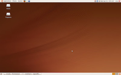
Gnome is the first GUI I used starting out in Linux..oh so long ago. It is one of the two "big" GUI's (along with KDE). I say big because it is heavily developed and fully modern. Ubuntu uses it as their default GUI (although that might be changing now that they have developed their own Unity GUI) so it has had quite a bit of mainstream exposure. It is also the default GUI choice for many live CD distros (Fedora, Debian, and others). It is very Mac OS like (as seen below) and it is well laid out. The "start" button is at the top left and the "sys tray" is in the upper right hand corner. Over all it has a very intuitive layout for Linux newbies.
KDE
KDE runs very close "second" in the world of Linux GUI's. Even though it isn't as widely used as Gnome it is my current desktop environment of choice for a couple reasons. First, it is very "windows" like. The "Start" button is where you would expect it to be, you can modify this to look almost identical to windows (if that is your thing) and the dolphin file explorer has a windows like flavor to it. The main reason I like it though is the polish. It is beautiful. Lots of work was done to give KDE that WOW factor. From transparency effects to cool desktop effects there is lots to see in KDE. Think of Gnome as the kiddie pool, great for everyone but net enough depth...KDE is like a water park, fun for all ages ;) . See below for a screenshot of KDE.
LXDE
From their site "The "Lightweight X11 Desktop Environment" is an extremely fast-performing and energy-saving desktop environment. Maintained by an international community of developers, it comes with a beautiful interface, multi-language support, standard keyboard short cuts and additional features like tabbed file browsing. LXDE uses less CPU and less RAM than other environments. It is especially designed for cloud computers with low hardware specifications, such as, netbooks, mobile devices (e.g. MIDs) or older computers. LXDE can be installed with many Linux distributions including Ubuntu, Debian and Fedora. It is the standard for Knoppix and lubuntu. LXDE also runs with OpenSolaris and BSD. LXDE provides a fast desktop experience; connecting easily with applications in the cloud. LXDE supports a wealth of programs that can be installed locally with Linux systems. The source code of LXDE is licensed partly under the terms of the the General Public License and partly under the LGPL."
I have not used the GUI before so I don't have an educated opinion on it, but I think it looks pretty sweet for how efficient it is (or claim it to be). It has a pretty large user base so I would say it more than likely lives up to its claims. See a screenie below.
xWindows Managers
If you feel more comfortable on the command line, but just need to surf the web in 32bit color for a bit, check out the wide variety of xWindows Managers. At their core they typically don't have anything too fancy, typically just a desktop and a task bar somewhere. Their menu is usually brought up by right clicking on the desktop. From there you can launch most applications. One nice thing about these windows managers is that they are easy to customize in a variety of functional and cosmetic ways. A couple popular flavors are Fluxbox, ICEWM, and Enlightenment (or just E). The best thing about these managers is that they are typically very lightweight and are perfect for computers that either aren't very fast or where disk space is at a premium (like a live cd or bootable flash drive. I typically install a xWindow manager on my old celerons and other similar systems. Check out http://xwinman.org/ for more detailed breakdown of the GUI's. Below are a couple screen shots of Fluxbox and Enlightenment.
Thanks for reading! :D
Subscribe to:
Posts (Atom)